Creating Accessible Content from images to accommodation requests.
- Introduction to Accessibility
- Headings
- Links and Text
- Color Issues
- Graphics
- Multimedia
- Tables
Introduction to Accessibility:
Daemen is committed to ensuring equal access and full participation in all university programs. Accessibility Services is the designated department by the University to determine reasonable and appropriate accommodations for students with disabilities. Students may request accommodations for the classroom, testing, housing, dining, etc. by notifying Accessibility Services and entering into the interactive process. Contact Accessibility Services via email at access@daemen.edu, by phone at 716-839-8228 or in person at the Student Success Center on the first floor of the Research and Information Commons (RIC).
Prospective students, please note that disability related information should be sent directly to Accessibility Services. It is not included in the academic records sent to admissions by your school.
Introduction to Accessibility:
Use the links in the Accessibility menu to learn how to create accessible course content. Below, you will find information about how some of the primary tools used for online course delivery meet accessibility guidelines.
Blackboard is the current learning management system for the university and conforms to web content accessibility guidelines (WCAG) 2.0 Priority AA. Additionally, the National Federation of the Blind (NFB) awarded Blackboard gold level certification for non-visual access.
While the learning management system is considered to be accessible, faculty must take care to ensure that content placed in Blackboard conforms to accessibility standards and does not present barriers for students. Proper formatting of content must be used by the faculty or course builder since the learning management has no way to know, for example, that the faculty intended for certain text to be a heading or a list item unless it is properly coded. Also, faculty and instructors might choose to use third-party resources from publishers and other sources. Many of these sources will include an accessibility statement, but contact your instructional designer if you have questions about whether or not your selected resources might present a barrier to learners.
Headings:
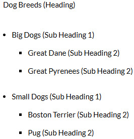
The use of proper headings is one of the most important formatting cues for a screen reader user. Proper heading structure enables learners to understand the structural hierarchy of the document.
Proper heading structure starts with a single top-level heading (Heading 1), which serves as the page title. Subheadings follow in a hierarchical order: Heading 2 for the first level of subheadings, Heading 3 for the next, and so on, down to Heading 6. While the terminology may vary in Blackboard, the basic structure remains the same.
Add Headings in Blackboard Content Editor:
1. In the content editor, highlight the desired text.
2. Select the proper heading level from the formatting selector (e.g. Heading for a top-level heading; Sub Heading 1 for a subheading of the top-level heading, etc.).
Here is an example of the heading structure in the Blackboard content editor:
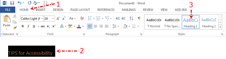
Adding Headings in MS Word:
1. Select the Home tab.
2. Highlight the text to be linked.
3. Select the appropriate heading selector in the styles panel (e.g. Heading 1 for top-level heading).
To ensure accessibility for all readers, regardless of ability, it’s important to follow best practices when writing text and creating hyperlinks for online audiences.
See Accessibility Cheat sheets from The National Center on Disability and Access to Education.
Proper heading structure starts with a single top-level heading (Heading 1), which serves as the page title. Subheadings follow in a hierarchical order: Heading 2 for the first level of subheadings, Heading 3 for the next, and so on, down to Heading 6. While the terminology may vary in Blackboard, the basic structure remains the same.
Add Headings in Blackboard Content Editor:
1. In the content editor, highlight the desired text.
2. Select the proper heading level from the formatting selector (e.g. Heading for a top-level heading; Sub Heading 1 for a subheading of the top-level heading, etc.).
Here is an example of the heading structure in the Blackboard content editor:
Adding Headings in MS Word:
1. Select the Home tab.
2. Highlight the text to be linked.
3. Select the appropriate heading selector in the styles panel (e.g. Heading 1 for top-level heading).
To ensure accessibility for all readers, regardless of ability, it’s important to follow best practices when writing text and creating hyperlinks for online audiences.
See Accessibility Cheat sheets from The National Center on Disability and Access to Education.
Links and Texts:
You should follow some general best practices when writing for online readers to make sure that text and hyperlinks are accessible for all readers regardless of ability.
Links:
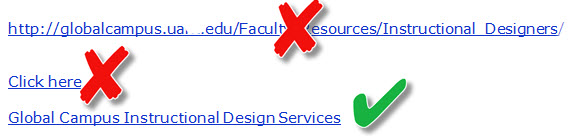
– Links should include meaningful text, so users understand the destination of the link.
– Links should make sense out of context since some screen readers, including JAWS, enables users to read the links.
– Never use text such as “click here” or “read more” since this language is not descriptive.
– Avoid using web addresses; instead, type in meaningful text and hyperlink this text to the target location. If you think students will be printing a page, you can include the web address unlinked in parentheses, following the linked text, such as Daemen University (https://daemen.edu).
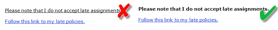
– Links should be underlined and lighter or darker than the main text. This allows users who are colorblind to find them more easily.
– Do not underline text if it is not a link since users with low vision or color blindness may have difficulty distinguishing this text from linked text.
Font Size:
General Documents:
Applications should use relative font sizes for better accessibility, but if absolute sizes are used, body text should be around 12 points and footnotes at least 9 points for readability.
Font Face:
Serif fonts have small lines at the ends of characters, while sans-serif fonts are more legible online, and decorative or narrow fonts should be used only for headlines or decorative purposes.
Links:
– Links should include meaningful text, so users understand the destination of the link.
– Links should make sense out of context since some screen readers, including JAWS, enables users to read the links.
– Never use text such as “click here” or “read more” since this language is not descriptive.
– Avoid using web addresses; instead, type in meaningful text and hyperlink this text to the target location. If you think students will be printing a page, you can include the web address unlinked in parentheses, following the linked text, such as Daemen University (https://daemen.edu).
– Links should be underlined and lighter or darker than the main text. This allows users who are colorblind to find them more easily.
– Do not underline text if it is not a link since users with low vision or color blindness may have difficulty distinguishing this text from linked text.
Font Size:
General Documents:
Applications should use relative font sizes for better accessibility, but if absolute sizes are used, body text should be around 12 points and footnotes at least 9 points for readability.
Font Face:
Serif fonts have small lines at the ends of characters, while sans-serif fonts are more legible online, and decorative or narrow fonts should be used only for headlines or decorative purposes.
Color Issues:
When using color to convey information there are several issues to consider to make sure that everyone gets the information regardless of ability.
Color Contrast
Make sure to use adequate contrast between the text and background. WCAG 2.0 requires a contrast ratio of 4.5:1 for normal text and 3:1 for large text. Examples of good and poor contrast are displayed below.
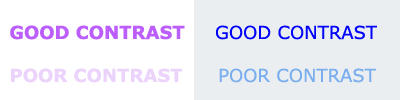
WebAIM provides a color contrast checker to help you select high-contrast color combinations.
Color Blindness/Color Deficient Vision:
– Do NOT use color alone to convey meaning (e.g. red text for important content). Use a secondary method, as well, such as italics or bold for text.
– Avoid red and black combinations. People who cannot detect red will confuse red and black, so the item will not be legible.
– Avoid red and green combinations. Approximately 5% of people cannot distinguish between red and green.
– Avoid blue and yellow combinations.
The example below shows an image with red background, a green tree, and a yellow sun. On the left is how a person without color blindness views it. On the right is how it appears to someone with Deuteranopia, a common type of color blindness. As you can see, the green tree and red background are very hard to distinguish.

This color blindness simulator by Color Vision will help you understand how different colors appear to people with different types of color blindness.
Colblindor allows you to upload images and view them as people with various types of color blindness would view them.
Color Contrast
Make sure to use adequate contrast between the text and background. WCAG 2.0 requires a contrast ratio of 4.5:1 for normal text and 3:1 for large text. Examples of good and poor contrast are displayed below.
WebAIM provides a color contrast checker to help you select high-contrast color combinations.
Color Blindness/Color Deficient Vision:
– Do NOT use color alone to convey meaning (e.g. red text for important content). Use a secondary method, as well, such as italics or bold for text.
– Avoid red and black combinations. People who cannot detect red will confuse red and black, so the item will not be legible.
– Avoid red and green combinations. Approximately 5% of people cannot distinguish between red and green.
– Avoid blue and yellow combinations.
The example below shows an image with red background, a green tree, and a yellow sun. On the left is how a person without color blindness views it. On the right is how it appears to someone with Deuteranopia, a common type of color blindness. As you can see, the green tree and red background are very hard to distinguish.
This color blindness simulator by Color Vision will help you understand how different colors appear to people with different types of color blindness.
Colblindor allows you to upload images and view them as people with various types of color blindness would view them.
Graphics:
Textual alternatives to images should be provided for learners with visual and certain cognitive disabilities employing screen readers. This also enables images to be understood in the event that they are not displayed in the browser.
The type of textual alternative used will depend on the type of the image displayed. For simple graphics, Alternative (ALT) text can be used.
ALT Attributes or Alternative Text:
Alternative text provides a textual description of graphics and other non-text content.
– It is read by screen readers to users with certain visual or cognitive disabilities so they can understand the content and function of the item.
– It is displayed when an image does not display on a page (due to browser incompatibility or other issues).
Here are a few important things to remember about ALT text
– Do not include the words “image of” or “graphic of” in the ALT text; that is a given.
– Decorative images do not require a text alternative, but they should include null ALT text (alt=” “) so the screen reader knows to skip the image. Unfortunately, there is no way to add null text in a Word document. In Blackboard, you must add this through HTML view.
ALT text should explain the content, not describe the image.
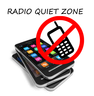 For instance, ALT text for the image to the right should simply state “radio quiet zone”, not “cell phones with circle/slash over one phone and radio quiet zone text”.
Add ALT Text:
Both word processing programs like MS Word and learning management systems like Blackboard offer options to add ALT text when inserting graphics.
The type of textual alternative used will depend on the type of the image displayed. For simple graphics, Alternative (ALT) text can be used.
ALT Attributes or Alternative Text:
Alternative text provides a textual description of graphics and other non-text content.
– It is read by screen readers to users with certain visual or cognitive disabilities so they can understand the content and function of the item.
– It is displayed when an image does not display on a page (due to browser incompatibility or other issues).
Here are a few important things to remember about ALT text
– Do not include the words “image of” or “graphic of” in the ALT text; that is a given.
– Decorative images do not require a text alternative, but they should include null ALT text (alt=” “) so the screen reader knows to skip the image. Unfortunately, there is no way to add null text in a Word document. In Blackboard, you must add this through HTML view.
ALT text should explain the content, not describe the image.
For instance, ALT text for the image to the right should simply state “radio quiet zone”, not “cell phones with circle/slash over one phone and radio quiet zone text”.Add ALT Text:
Both word processing programs like MS Word and learning management systems like Blackboard offer options to add ALT text when inserting graphics.
Multimedia:
To make multimedia accessible includes creating text transcripts and captioning videos. The process is different across different video platforms.
Audio – transcript
For audio files, a text transcript should be made available.
WCAG 2.0 Guideline 1.2.1—”An alternative for time-based media is provided that presents equivalent information for prerecorded audio-only content.”
Video – captions
If videos are used, a synchronized transcript (captions) should be used.
WCAG 2.0 Guideline 1.2.2—”Captions are provided for all prerecorded audio content in synchronized media, except when the media is a media alternative for text and is clearly labeled as such.”
YouTube
Do not rely on YouTube’s auto-captioning feature. As many of you know, YouTube has an auto-captioning feature. It is important to note that the results are usually too inaccurate to use (captions less than 90% accurate are considered useless), so do not rely on this feature. You can, however, use the automatic caption as a starting point and make corrections to the file so it is accurate. Learn how to add and edit YouTube captions.
If you click the “cc” button on the video and only see the auto-caption feature, the video does not include true captioning. If you view the captions and listen to the video while watching the captions, you will likely notice many problems.
If you have a caption file available (SRT format), you can upload this to your YouTube account. If you need a caption file generated, you can use a third party tool.
Additional Resources
Captions, Transcripts, and Audio Descriptions from WebAIM – Learn more about creating accessible video and audio.
Tables:
Tables should be used for displaying data, not for page layout, as layout tables limit content flexibility and may not be read in the correct order by screen readers.
Tips for Accessible Tables:
Even when using data tables, some basic rules should be followed:
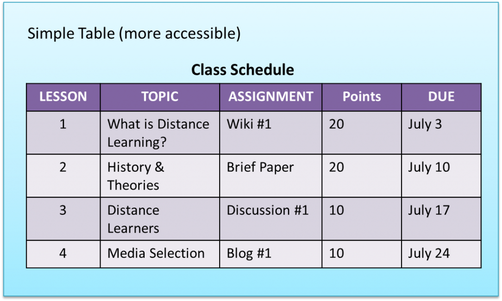
– Use a table caption so people will understand the content of the table; some applications will prompt you for the input of captions and will code it properly.
– Use table headers for data tables to describe the content of the column or row. This helps students understand the information laid out in the table.
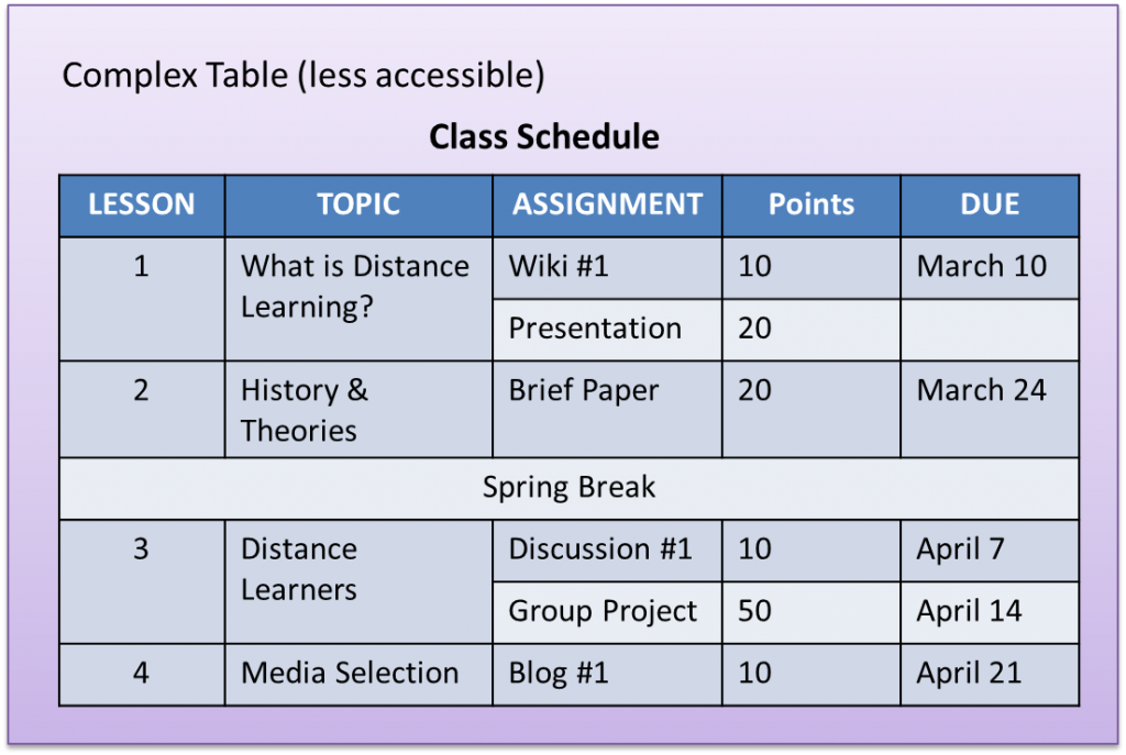
Make sure the content will be read in a logical order.
Avoid merging cells, when possible:
You should use the simplest configuration possible. If merging is necessary, make sure content is read in the correct order (try to tab through table content).
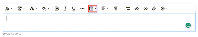
Create Tables:
Creating tables in Blackboard is easy. The option to insert tables appears in the toolbar that appears when editing content and assignment information.
Tips for Accessible Tables:
Even when using data tables, some basic rules should be followed:
– Use a table caption so people will understand the content of the table; some applications will prompt you for the input of captions and will code it properly.
– Use table headers for data tables to describe the content of the column or row. This helps students understand the information laid out in the table.
Make sure the content will be read in a logical order.
Avoid merging cells, when possible:
You should use the simplest configuration possible. If merging is necessary, make sure content is read in the correct order (try to tab through table content).
Create Tables:
Creating tables in Blackboard is easy. The option to insert tables appears in the toolbar that appears when editing content and assignment information.